Comprehensive Slope Analysis(1): Multi-Timeframe & Cross-Market Trends
[DISCLAIMER] This article is for educational and informational purposes only and does not constitute investment advice.You are solely responsible for your own investment decisions.
HaoWai(Fxcns.com) shall not be liable for any financial losses that may arise from the use of information provided on this website.
After many years of deep ploughing in the field of quantitative trading, I have found that market trends are like a rushing river, with mainstreams and tributaries. To fully grasp market dynamics, a single time frame or single market analysis is often insufficient. Today, let's explore how to find trend resonance across time scales and markets through multi-dimensional slope analysis.
① The nature of time frames: slope differences from minute to month
As a long-time quantitative trading researcher, I am often asked, ‘Why does the same stock look like such a different trend in different time frames?’ This question leads to the first topic we're going to dive into today: the nature of time frames.
In our first two articles, we discussed in detail the basic concepts and advanced calculations of slope. Today, we're going to apply that knowledge to a broader perspective. Differences in slope across time frames actually reflect the behavioural characteristics of market participants on different time scales.
Let's understand this through a concrete example:
import pandas as pd
import numpy as np
import matplotlib.pyplot as plt

def calculate_slopes_multiple_timeframes(price_data, timeframes=['1H', '4H', '1D']):
    """
    Calculate slopes for different time frames

    parametric:
    price_data: Raw price data (assuming minute level)
    timeframes: List of time frames to be calculated
    """
    results = {}

    for tf in timeframes:
        # Resampling data
        resampled = price_data.resample(tf).agg({
            'open': 'first',
            'high': 'max',
            'low': 'min',
            'close': 'last'
        })

        # Calculate the slope (using a 20-cycle window)
        slopes = pd.Series(index=resampled.index)
        window = 20

        for i in range(window, len(resampled)):
            y = resampled['close'].iloc[i-window:i]
            x = np.arange(window)
            slope, _ = np.polyfit(x, y, 1)
            slopes.iloc[i] = slope

        results[tf] = slopes

    return results
This function helps us to understand the slope characteristics of the same market in different time frames. Interestingly, we often find that:
- slopes for short-term time frames (e.g. minute level) are more volatile and reflect short-term noise in the market.
- slopes for medium-term time frames (e.g. hourly) are more reflective of the current dominant trend.
- the slopes of long-term time frames (e.g. daily, weekly) demonstrate the fundamental market trend.
However, the slopes of these different time frames do not exist in isolation. Just as tributaries in a river eventually merge into the main stream, the trends of different time frames are intrinsically linked. In the next section, we will explore how to coordinate and integrate information from these different time scales.
② Methods of slope analysis for multiple time frames
Having understood the properties of different time frames, the key question is how to effectively integrate this information. This is like looking at a painting, where we need to see both the overall composition (long-term trends) and pay attention to local details (short-term fluctuations).
2.1 Time frame harmonisation: ensuring data consistency
First, let's look at how to ensure data consistency across time frames:
def align_timeframe_data(hourly_data, timeframes=['1h', '4h', '1d']):
    """
    Harmonisation of data from different time frames, based on hourly data

    parametric:
    hourly_data: Hourly base data (‘1H’)
    timeframes: List of larger time frames to be analysed

    return:
    DataFrame: Alignment data containing the slopes of all time frames
    """
    aligned_slopes = {}


    # Calculating the slope of a larger time frame
    for tf in timeframes:
        # Resampling data
        resampled = hourly_data.resample(tf).agg({
            'close': 'last',
            'volume': 'sum'
        }).dropna()

        # Calculate the standardised slope
        slopes = calculate_normalized_slope(resampled['close'], window=20)

        # Aligning slope data to the hourly frame
        if tf == '1h':
        	aligned_slopes[tf] = slopes
        else:
        	# Aligning slope data to the hourly frame
            aligned_slopes[tf] = slopes.reindex(aligned_slopes['1h'].index, method='ffill')

    return pd.DataFrame(aligned_slopes)


def calculate_normalized_slope(prices, window=20):
    """
    Calculate the standardised slope
    """
    slopes = pd.Series(index=prices.index)
    price_std = prices.rolling(window).std()

    for i in range(window, len(prices)):
        y = prices.iloc[i-window:i]
        x = np.arange(window)
        slope, _ = np.polyfit(x, y, 1)
        # Standardised slope using standard deviation
        slopes.iloc[i] = slope / price_std.iloc[i] if price_std.iloc[i] != 0 else 0

    return slopes


# usage example
# Get aligned slope data
aligned_slopes = align_timeframe_data(hourly_data)

print(f"data shape: {aligned_slopes.shape}")
print("\nNumber of non-null values per time frame:")
print(aligned_slopes.count())

# Shows aligned slope data for the month of May
monthly_mask = (aligned_slopes.index.year == 2024) & (aligned_slopes.index.month == 5)
aligned_slopes[monthly_mask].plot()
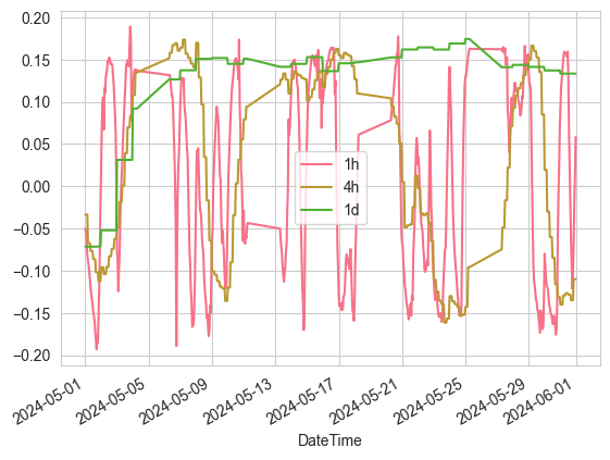
The key to this method is:
- using normalisation to make the slopes comparable across different time frames
- ensures that data from different time frames are synchronised in time through resampling and data alignment
- volume information is taken into account to add dimension to the analysis
2.2 Slope Overlay Technique: Synthesising Trends from Different Time Scales
Now, let's see how we can integrate slope information from different time frames:
def composite_slope_indicator(aligned_slopes, weights={'1h': 0.3, '4h': 0.3, '1d': 0.4}):
    """
    Creation of an integrated slope indicator

    parametric:
    aligned_slopes: Aligned slope data for each time frame
    weights: Weighting of time frames
    """
    composite = pd.Series(0, index=aligned_slopes.index)

    for tf, weight in weights.items():
        composite += aligned_slopes[tf] * weight

    return composite


# Get the slope data for the combination
composite_slope = composite_slope_indicator(aligned_slopes)

# Showing the combined slope data for the month of May
composite_slope[monthly_mask].plot()
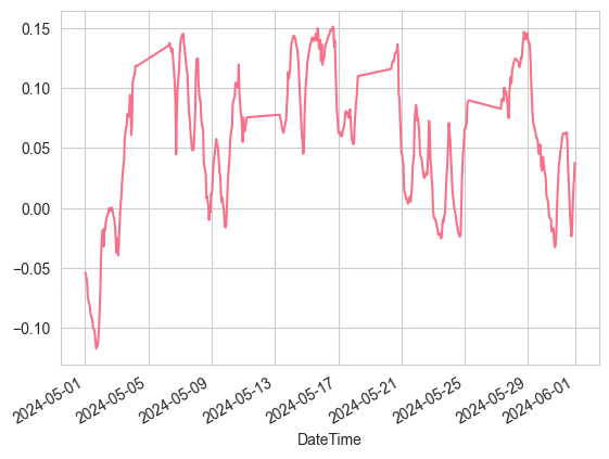
This composite indicator has several notable features:
- Adjustable weights: the weights of different time frames can be adjusted according to the trading strategy.
- Signal Confirmation: Provides a more reliable signal when the trends of multiple timeframes are in agreement
- Conflict Recognition: Provides early warning when the trends of different time frames diverge.
In practice, I have found that this multiple timeframe analysis helps us to:
- Better identify dominant trends
- Find more appropriate entry points
- Reduce the impact of false signals
However, it is important to note that as the dimensionality of the analysis increases, we are also faced with more complex signal interpretation issues. This challenge will be discussed in detail later in this article. It is worth noting that in the next article we will look at how to translate these analyses into specific trading strategies.
③ Cross-market slope correlation
In financial markets, the connections between different markets are like an invisible web. As a veteran quantitative analyst, I have found that slope analysis is uniquely suited to reveal these market correlations.
3.1 Slope Relationship between FX Pairs and Commodities
Let's start with a classic example - the relationship between EUR/USD and the price of gold:
def analyze_cross_market_slopes(market1_data, market2_data, window=30):
    """
    Analysing the slope correlation between two markets

    parametric:
    market1_data, market2_data: Price data for both markets
    window: Window size for calculating slope and correlation
    """
    # Calculate the standardised slope of the two markets
    slopes1 = calculate_normalized_slope(market1_data, window)
    slopes2 = calculate_normalized_slope(market2_data, window)

    # Merge the slope data into a DataFrame and align the data
    combined_slopes = pd.DataFrame({
        'slopes1': slopes1,
        'slopes2': slopes2
    })

    # Delete rows containing null values
    combined_slopes = combined_slopes.dropna()

    # Printing debugging information
    print("\nBefore data processing:")
    print("Slopes1 shape:", slopes1.shape)
    print("Slopes2 shape:", slopes2.shape)
    print("NaN in slopes1:", slopes1.isna().sum())
    print("NaN in slopes2:", slopes2.isna().sum())

    print("\nPost-processing data:")
    print("Combined shape:", combined_slopes.shape)
    print("NaN in combined data:", combined_slopes.isna().sum().sum())

    # Calculating rolling correlations
    correlation = combined_slopes['slopes1'].rolling(window).corr(combined_slopes['slopes2'])

    # Calculate the lead-lag relationship
    lead_lag = pd.DataFrame(index=combined_slopes.index)
    for lag in range(-5, 6):
        if lag > 0:
            shifted_slopes2 = combined_slopes['slopes2'].shift(lag)
            corr = combined_slopes['slopes1'].rolling(window).corr(shifted_slopes2)
        else:
            shifted_slopes1 = combined_slopes['slopes1'].shift(-lag)
            corr = shifted_slopes1.rolling(window).corr(combined_slopes['slopes2'])

        lead_lag[f'lag_{lag}'] = corr

    print("\nResults statistics:")
    print("Correlation NaN count:", correlation.isna().sum())
    print("Total periods in correlation:", len(correlation))

    return correlation, lead_lag


def visualize_cross_market_analysis(correlation, lead_lag):
    """
    Visualisation of cross-market analysis results

    parametric:
    correlation: correlation time series (statistics)
    lead_lag: Lead-Lag Relationship DataFrame
    """
    # Creating subplots with shared x-axis
    fig, (ax1, ax2) = plt.subplots(2, 1, figsize=(12, 8), sharex=True)

    # Plotting correlation time series
    ax1.plot(range(len(correlation)), correlation.values, label='relevance')
    ax1.set_title('Slope correlation over time')
    ax1.axhline(y=0, color='r', linestyle='--', alpha=0.3)
    ax1.grid(True)
    ax1.set_ylabel('relevance')

    # Set the x-axis scale of the first plot
    n_ticks = 5  # Set the number of scales you want to display
    step = len(correlation) // (n_ticks - 1)
    tick_positions = np.arange(0, len(correlation), step)
    tick_labels = correlation.index[::step]
    ax1.set_xticks(tick_positions)
    ax1.set_xticklabels(tick_labels, rotation=45)

    # Lead-lag heat map
    im = ax2.imshow(lead_lag.T,
                    aspect='auto',
                    extent=[0, len(lead_lag), -5.5, 5.5],
                    cmap='RdBu_r',
                    interpolation='nearest')

    # Set the x-axis scale for the second plot (same as the first)
    ax2.set_xticks(tick_positions)
    ax2.set_xticklabels(tick_labels, rotation=45)

    # Setting the y-axis labels
    ax2.set_ylabel('Lead/lag cycle')
    ax2.set_title('Lead-lag relationship analysis')

    # Adding a colour bar
    plt.colorbar(im, ax=ax2, label='correlation strength')

    # Restructuring of the layout
    plt.tight_layout()

    return fig

def enhanced_visualize_cross_market_analysis(correlation, lead_lag,
                                           title=None,
                                           show_threshold=False,
                                           threshold=0.5):
    """
    Enhanced Visual Functions
    """
    # Creating subplots with shared x-axis
    fig, (ax1, ax2) = plt.subplots(2, 1, figsize=(12, 8), sharex=True)

    if title:
        fig.suptitle(title, y=1.02, fontsize=14)

    # Plotting correlation time series
    ax1.plot(range(len(correlation)), correlation.values, label='relevance')
    ax1.set_title('Slope correlation over time')
    ax1.axhline(y=0, color='r', linestyle='--', alpha=0.3, label='zero line')

    if show_threshold:
        ax1.axhline(y=threshold, color='g', linestyle='--', alpha=0.3, label=f'thresholds ({threshold})')
        ax1.axhline(y=-threshold, color='g', linestyle='--', alpha=0.3)

    ax1.grid(True)
    ax1.set_ylabel('relevance')
    ax1.legend()

    # Set the x-axis scale of the first plot
    n_ticks = 5  # Set the number of scales you want to display
    step = len(correlation) // (n_ticks - 1)
    tick_positions = np.arange(0, len(correlation), step)
    tick_labels = correlation.index[::step]
    ax1.set_xticks(tick_positions)
    ax1.set_xticklabels(tick_labels, rotation=45)

    # Lead-lag heat map
    im = ax2.imshow(lead_lag.T,
                    aspect='auto',
                    extent=[0, len(lead_lag), -5.5, 5.5],
                    cmap='RdBu_r',
                    interpolation='nearest')

    # Set the x-axis scale for the second plot (same as the first)
    ax2.set_xticks(tick_positions)
    ax2.set_xticklabels(tick_labels, rotation=45)

    # Setting y-axis labels and scales
    ax2.set_ylabel('Lead/lag cycle')
    ax2.set_yticks(np.arange(-5, 6))
    ax2.set_title('Lead-lag relationship analysis')

    # Adding a colour bar
    cbar = plt.colorbar(im, ax=ax2)
    cbar.set_label('correlation strength')

    # Restructuring of the layout
    plt.tight_layout()

    return fig


# Obtain the slope correlation of the two varieties
correlation_analyze, analyze_lead_lag = analyze_cross_market_slopes(resampled_df1['close'], resampled_df2['close'])

# Correlation chart showing May only
monthly_mask3 = (correlation_analyze.index.year == 2024) & (correlation_analyze.index.month == 5)

analyze_lead_lag3 = (analyze_lead_lag.index.year == 2024) & (analyze_lead_lag.index.month == 5)
fig = visualize_cross_market_analysis(correlation_analyze[monthly_mask3], analyze_lead_lag[analyze_lead_lag3])


plt.show()
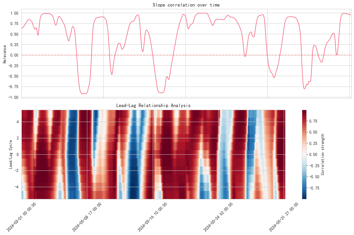
This analysis reveals some interesting phenomena:
- The slope correlation between EUR/USD and the price of gold tends to be significantly stronger in a given market environment
- There may be a lead-lag relationship in this correlation, opening up forecasting possibilities
- Sudden changes in the correlation may signal a shift in market conditions
3.2 The link between stock indices and individual stock slopes
In the stock market, the slope relationship between individual stocks and the broader market is also worth examining:
This method of analysis helps us to:
- Identify unique movements in individual stocks
- Identify potential alpha opportunities
- Optimise portfolio risk management
It is important to note that these cross-market relationships are not static. In our next post, we'll explore how to integrate these relationships into actual trading strategies. For now, let's continue to delve into how to develop more sophisticated multi-dimensional slope indicators.


