Advanced Slope Analysis: Mastering Financial Market Complexity
[DISCLAIMER] This article is for educational and informational purposes only and does not constitute investment advice.You are solely responsible for your own investment decisions.
HaoWai(Fxcns.com) shall not be liable for any financial losses that may arise from the use of information provided on this website.
In the previous post, we explored the basics and simple applications of slope analysis. Today, we will dive into advanced slope calculations. This is an increasingly important tool in financial market analysis. It not only helps us cope with the complexity of the market, but also provides a more precise guide for investment decisions.
① Logarithmic yield slope and its advantages
The logarithmic yield slope is a powerful yet often overlooked tool in financial market analysis. The logarithmic yield slope has significant advantages over ordinary price slopes, especially when dealing with long-term trends and assets with different price scales.
First, let's understand what logarithmic yield is. Logarithmic yield is the change in the natural logarithm of an asset's price. The mathematical expression is:
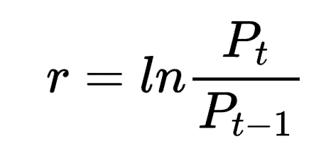
where r is the logarithmic rate of return, Pt is the current price, and Pt-1 is the previous period's price.
The logarithmic yield slope is calculated by performing a linear regression on the logarithmic yield over time, and the resulting slope is our desired logarithmic yield slope.
The main advantages of logarithmic yield slope include:
- standardisation: logarithmic yield can standardise assets at different price levels, allowing high and low prices to be directly compared.
- Compounding effect: Logarithmic yields better reflect the compounding effect, which is particularly important in long-term analyses.
- Symmetry: Log returns are symmetrical in the positive and negative directions, which makes upward and downward movements easier to compare.
- Stability: Logarithmic returns are usually more stable than ordinary returns, reducing the impact of extreme values.
Let's illustrate how to calculate the logarithmic yield slope with a simple Python example:
import pandas as pd
import numpy as np
import matplotlib.pyplot as plt
from scipy import stats
import seaborn as sns

# Setting seaborn style
sns.set_style("whitegrid")  # Or use "darkgrid", "white", "dark", "ticks"

# Create canvas and sub-images
fig, axes = plt.subplots(2, 1, figsize=(15, 12), sharex=True)

# Set the color scheme (optional)
sns.set_palette("husl")

# Original price graph
for asset in ['Asset1', 'Asset2']:
    axes[0].plot(df.index, df[asset], label=asset)
axes[0].set_title('Asset Prices')
axes[0].legend()
axes[0].grid(True)

# Logarithmic return slope
for asset in ['Asset1', 'Asset2']:
    axes[1].plot(df.index, results[asset]['log_slope'], label=f'{asset} Log Slope')
axes[1].set_title('Log Return Slopes')
axes[1].legend()
axes[1].grid(True)
axes[1].axhline(y=0, color='r', linestyle='--', alpha=0.3)  # Add zero line reference

# Adjust x-axis labels
plt.xticks(rotation=45)
fig.autofmt_xdate()  # Automatic formatting of date labels


# Adjust spacing between subgraphs
plt.tight_layout()

# Display graphics
plt.show()
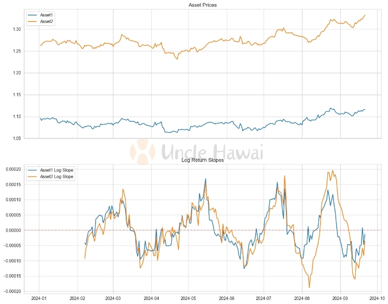
This function calculates the slope of the logarithmic return within a rolling window. By adjusting the window size, we can capture trends on different time scales.
In practice, the logarithmic yield slope can help us identify long-term trends, compare the performance of different asset classes, and even play a role in cross-market analysis. For example, when we compare the trend of an overpriced stock with that of a underpriced stock, the logarithmic yield slope can provide a fairer basis for comparison.
However, it is important to note that logarithmic yield slope, while powerful, is not foolproof. In short-term analysis or high-frequency trading, the ordinary price slope may be more intuitive. Therefore, choosing the appropriate slope calculation method should be based on the specific purpose and timeframe of the analysis.
While logarithmic yield slope offers many advantages, how can this method be effectively applied in multi-timeframe analysis? We will delve deeper into this question in a future article, showing how slope analyses on different time scales can be integrated to gain a more comprehensive view of the market.
In the next section, we will explore how to deal with non-linear trends, a common complication in financial markets. With polynomial regression, we can capture more complex market dynamics and add new tools to our analytical toolbox.
② Non-linear trends and polynomial regression
Trends in financial markets are often not simple straight lines, but show various complex non-linear patterns. This is why we need more advanced techniques to capture these complex market dynamics. Polynomial regression is one such powerful tool that can help us model and analyse non-linear trends.
Polynomial regression is an extension of linear regression that uses polynomial functions to model curvilinear relationships in data. The general form is:
y = β₀ + β₁x + β₂x² + ... + βₙxⁿ + ε
where n is the order of the polynomial, β is the coefficient, and ε is the error term.
In financial market analysis, polynomial regression can help us to:
- capture complex market cycles
- identify potential reversal points
- predict short- and medium-term trends more accurately
Let's walk through a Python example to illustrate how to use polynomial regression to analyse market trends:
import pandas as pd
import numpy as np
import matplotlib.pyplot as plt
from scipy import stats
from sklearn.preprocessing import PolynomialFeatures
from sklearn.linear_model import LinearRegression
import seaborn as sns

def polynomial_regression_slope(prices, degree=2, window=30):
    """
    Calculating the slope using polynomial regression
    """
    # Pre-create the Series that stores the results, filled with NaN
    slopes = pd.Series(np.nan, index=prices.index)

    x = np.arange(window).reshape(-1, 1)
    poly_features = PolynomialFeatures(degree=degree, include_bias=False)
    x_poly = poly_features.fit_transform(x)

    for i in range(window, len(prices)):
        y = prices.iloc[i-window:i]
        if not y.isna().any():  # Make sure there are no missing values
            model = LinearRegression()
            model.fit(x_poly, y)

            # Calculate the slope of the last point
            last_x = x_poly[-1].reshape(1, -1)
            slope = np.sum(model.coef_ * last_x * np.arange(1, degree+1))
            slopes.iloc[i] = slope

    return slopes

# Calculate the slope
window = 30
results = {}
for asset in ['Asset1', 'Asset2']:
    results[asset] = {
        'poly_slope': polynomial_regression_slope(df[asset], degree=3, window=window),
    }

# Setting the seaborn style
sns.set_style("whitegrid")
sns.set_palette("husl")

# Creating canvases and subgraphs
fig, axes = plt.subplots(2, 1, figsize=(15, 12), sharex=True)

# Original Price Chart
for asset in ['Asset1', 'Asset2']:
    axes[0].plot(df.index, df[asset], label=asset)
axes[0].set_title('Asset Prices', fontsize=12, pad=10)
axes[0].legend()

# Polynomial regression slope
for asset in ['Asset1', 'Asset2']:
    axes[1].plot(df.index, results[asset]['poly_slope'], label=f'{asset} Poly Slope')
axes[1].set_title('Polynomial Regression Slopes (Degree 3)', fontsize=12, pad=10)
axes[1].legend()
axes[1].axhline(y=0, color='r', linestyle='--', alpha=0.3)  # Adding a Zero Line Reference

# Adjusting x-axis labels
plt.xticks(rotation=45)
fig.autofmt_xdate()  # Automatic formatting of date labels

# Adjusting the spacing between subgraphs
plt.tight_layout()

# Display Graphics
plt.show()
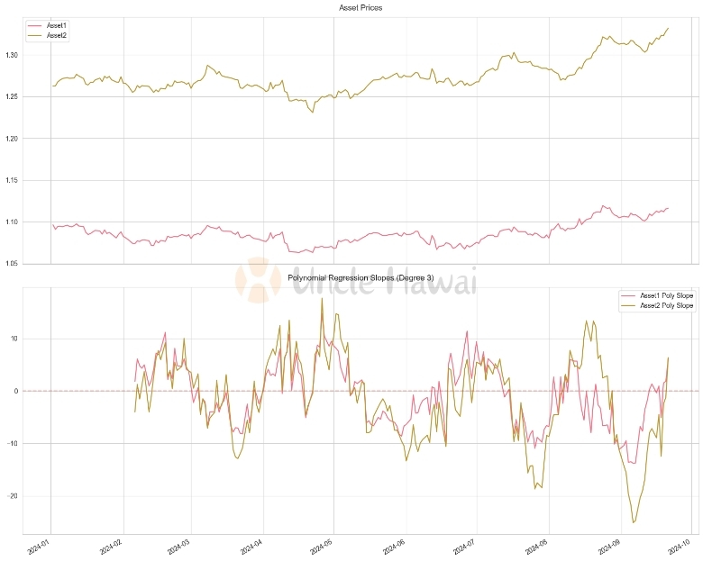
In this example, we used 3rd order polynomial regression to calculate the slope. This approach can capture more complex price patterns, such as accelerating upward or decelerating downward trends.
A key advantage of polynomial regression is that it can adapt to a variety of market conditions. For example, at the beginning of a bull market, we may see an upward convex curve, while near the top of the market, the curve may flatten out or begin to curve downward. By looking at the change in slope of the polynomial regression, we can identify these potential market turning points much earlier.
However, there are several issues to be aware of when using polynomial regression:
- Overfitting: Higher order polynomials may overfit the data, resulting in too much sensitivity to noise.
- Parameter selection: Choosing the appropriate polynomial order and window size is critical.
- Computational complexity: Higher order polynomial regression is more computationally intensive and may not be suitable for high frequency trading.
In practice, I usually use a combination of polynomial regressions of different orders to get a more comprehensive view of the market. For example, a 2nd order polynomial can help identify the overall trend, while a 3rd or 4th order polynomial can capture more subtle market dynamics.
In the next section, we will explore how to use dynamic time windows to further improve the accuracy and adaptability of slope calculations. This approach can help us better cope with changes in market volatility and provide a more accurate tool for our analyses.
③ Application of Dynamic Time Window in Slope Calculation
In financial market analysis, the fixed time window method of slope calculation, although simple and intuitive, is often difficult to adapt to changes in market volatility. This is why dynamic time windows are becoming increasingly important in slope calculation. Dynamic time windows automatically adjust to market conditions, thus providing more accurate and timely trend signals.
The core idea of dynamic time windows is to adjust the size of the time window used in the calculation of slope according to the volatility of the market. In less volatile markets, we can use a larger time window to minimise the effect of noise, while in high volatility markets, a smaller time window can help us capture trend changes more quickly.
Below is a Python example of calculating slope using a dynamic time window:
import numpy as np
import pandas as pd
import pandas as pd
import numpy as np
import matplotlib.pyplot as plt
from scipy import stats
from sklearn.preprocessing import PolynomialFeatures
from sklearn.linear_model import LinearRegression
import seaborn as sns

def dynamic_window_slope(prices, min_window=10, max_window=50, volatility_lookback=20):
    """
    Calculate slope using dynamic time window

    Parameter: prices
    prices: sequence of prices
    min_window: minimum window size
    max_window: maximum window size
    volatility_lookback: Calculation of the lookback period for volatility.
    """
    # Pre-create the Series that stores the results, filled with NaN
    slopes = pd.Series(np.nan, index=prices.index)

    # Calculating volatility
    returns = prices.pct_change()
    volatility = returns.rolling(window=volatility_lookback).std()

    # Handling extreme and missing values
    volatility = volatility.fillna(0)  # Fill NA value

    # If all values are the same, use the maximum window directly
    if volatility.min() == volatility.max():
        dynamic_window = pd.Series(max_window, index=prices.index)
    else:
        # Calculating Dynamic Window Size
        normalized_vol = (volatility - volatility.min()) / (volatility.max() - volatility.min())
        dynamic_window = ((1 - normalized_vol) * (max_window - min_window) + min_window)

    # Make sure the window size is within reason
    dynamic_window = dynamic_window.clip(min_window, max_window)
    # convert to an integer
    dynamic_window = dynamic_window.astype(int)

    # Calculate the slope
    for i in range(max_window, len(prices)):
        window = dynamic_window.iloc[i]
        x = np.arange(window)
        y = prices.iloc[i-window:i]
        if not y.isna().any():  # Make sure there are no missing values
            try:
                slope, _ = np.polyfit(x, y, 1)
                slopes.iloc[i] = slope
            except:
                continue

    return slopes

# Calculate the slope
window = 30
results = {}
for asset in ['Asset1', 'Asset2']:
    results[asset] = {
        'dynamic_slope': dynamic_window_slope(df[asset])
    }


# Setting the seaborn style
sns.set_style("whitegrid")
sns.set_palette("husl")

# Creating canvases and subgraphs
fig, axes = plt.subplots(2, 1, figsize=(15, 12), sharex=True)

# Original Price Chart
for asset in ['Asset1', 'Asset2']:
    axes[0].plot(df.index, df[asset], label=asset)
axes[0].set_title('Asset Prices', fontsize=12, pad=10)
axes[0].legend()

# Dynamic window slope
for asset in ['Asset1', 'Asset2']:
    axes[1].plot(df.index, results[asset]['dynamic_slope'], label=f'{asset} Dynamic Slope')
axes[1].set_title('Dynamic Window Slopes', fontsize=12, pad=10)
axes[1].legend()
axes[1].axhline(y=0, color='r', linestyle='--', alpha=0.3)  # 添加零线参考

# Adjusting x-axis labels
plt.xticks(rotation=45)
fig.autofmt_xdate()  # Automatic formatting of date labels

# Adjusting the spacing between subgraphs
plt.tight_layout()

# Display Graphics
plt.show()
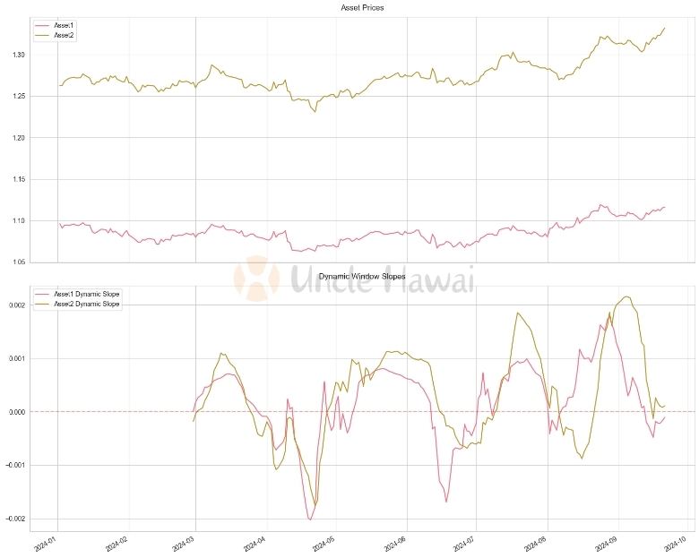
In this example, we dynamically adjust the size of the time window based on the volatility of the market. When volatility increases, the window becomes smaller, making the slope calculation more responsive to market changes; when volatility decreases, the window becomes larger, providing a smoother trend signal.
Key advantages of the dynamic time window approach include:
- Adaptability: the ability to automatically adapt to different market conditions.
- Improved signal quality: Provides more accurate trend signals in different volatile environments.
- Reduced lag: Captures trend changes faster during periods of high volatility.
However, the following points should be noted when using Dynamic Time Window:
- Parameter selection: The minimum and maximum window sizes, as well as the look-back period for volatility calculations, need to be carefully selected.
- Computational complexity: Dynamic windowing methods are more computationally intensive than fixed windows.
- Excessive sensitivity: It may be possible to be over-sensitive to short-term fluctuations in some cases.
In practice, I often use the dynamic time window method in combination with other technical indicators. For example, the Dynamic Window Slope can be combined with the Relative Strength Index (RSI) or Moving Averages to get a more comprehensive view of the market.
This approach is particularly suited to markets where volatility changes frequently, such as the foreign exchange market or certain highly volatile stocks. By dynamically adjusting the timeframe of the analysis, we can take a better pulse of the market and make more informed investment decisions.
Polynomial regression provides us with a powerful tool to deal with non-linear trends. However, how do you choose the best polynomial order? In a follow-up article, we will explore how to use machine learning techniques to automatically optimise these parameters and further improve the accuracy of our analysis.
In the next section, we will compare the performance of different slope calculation methods in stock trend analysis through a specific case study. This will help us better understand the practical application value of these methods and provide guidance in choosing the appropriate analytical tools.
④ Case study: comparing the performance of different slope calculation methods in stock trend analysis
In order to better understand the practical application of different slope calculation methods, let's compare their performance in stock trend analysis through a specific case study. We will use history data as an example to compare four methods: simple linear regression, logarithmic yield slope, polynomial regression slope, and dynamic time window slope.
First, let's get the data and implement these methods:
def simple_slope(prices, window=30):
    """
    Calculating Slope Using Simple Linear Regression

    Parameters.
    prices: pandas Series, price series
    window: int, window size for slope calculation

    Returns: pandas Series, contains the slope value, index corresponds to the input data.
    pandas Series, contains slope values, index corresponds to input data
    """
    # Pre-create the Series that stores the results, filled with NaN
    slopes = pd.Series(np.nan, index=prices.index)

    # Prepare X-values for regression (time indexing)
    x = np.arange(window)

    # Calculate the slope
    for i in range(window, len(prices) + 1):
        # Get price data in the window
        y = prices.iloc[i-window:i]

        # Check for missing values
        if not y.isna().any():
            try:
                # Calculate the slope using linregress from scipy.stats
                slope, _, _, _, _ = stats.linregress(x, y)
                slopes.iloc[i-1] = slope
            except:
                continue

    return slopes

# Calculate different types of slopes for two assets
window = 30
results = {}
for asset in ['Asset1', 'Asset2']:
    results[asset] = {
        'simple_slope': simple_slope(df[asset], window),
        'log_slope': log_return_slope(df[asset], window),
        'poly_slope': polynomial_regression_slope(df[asset], degree=3, window=window),
        'dynamic_slope': dynamic_window_slope(df[asset])
    }

# Setting the seaborn style
sns.set_style("whitegrid")
sns.set_palette("husl")

# Creating canvases and subgraphs
fig, axes = plt.subplots(5, 1, figsize=(15, 12), sharex=True)

# Original Price Chart
for asset in ['Asset1', 'Asset2']:
    axes[0].plot(df.index, df[asset], label=asset)
axes[0].set_title('Asset Prices', fontsize=12, pad=10)
axes[0].legend()

# simple slope
for asset in ['Asset1', 'Asset2']:
    axes[1].plot(df.index, results[asset]['simple_slope'], label=f'{asset} Simple Slope')
axes[1].set_title('Simple Slopes', fontsize=12, pad=10)
axes[1].legend()
axes[1].axhline(y=0, color='r', linestyle='--', alpha=0.3)  # Adding a Zero Line Reference

# Slope of logarithmic rate of return
for asset in ['Asset1', 'Asset2']:
    axes[2].plot(df.index, results[asset]['log_slope'], label=f'{asset} Log Slope')
axes[2].set_title('Log Return Slopes', fontsize=12, pad=10)
axes[2].legend()
axes[2].axhline(y=0, color='r', linestyle='--', alpha=0.3)  # Adding a Zero Line Reference

# Polynomial regression slope
for asset in ['Asset1', 'Asset2']:
    axes[3].plot(df.index, results[asset]['poly_slope'], label=f'{asset} Poly Slope')
axes[3].set_title('Polynomial Regression Slopes (Degree 3)', fontsize=12, pad=10)
axes[3].legend()
axes[3].axhline(y=0, color='r', linestyle='--', alpha=0.3)  # Adding a Zero Line Reference

# Dynamic window slope
for asset in ['Asset1', 'Asset2']:
    axes[4].plot(df.index, results[asset]['dynamic_slope'], label=f'{asset} Dynamic Slope')
axes[4].set_title('Dynamic Window Slopes', fontsize=12, pad=10)
axes[4].legend()
axes[4].axhline(y=0, color='r', linestyle='--', alpha=0.3)  # Adding a Zero Line Reference

# Adjusting x-axis labels
plt.xticks(rotation=45)
fig.autofmt_xdate()  # Automatic formatting of date labels

# Add general title
fig.suptitle('Comparison of Different Slope Calculation Methods',
             fontsize=14, y=1.02)

# Adjusting the spacing between subgraphs
plt.tight_layout()

# Display Graphics
plt.show()
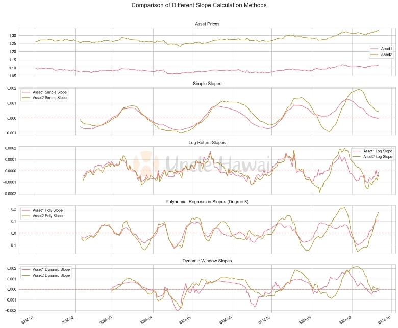
This code implements four different methods for calculating slope and applies them to Apple's stock data. Let's analyse the performance of each method:
- Simple Linear Regression Slope: This method provides the most intuitive indication of trend. It captures the overall trend, but is sensitive to short-term fluctuations.
- Logarithmic Return Slope: This method is more sensitive to percentage changes in price than Simple Linear Regression. It is more advantageous when dealing with long-term trends and comparing assets at different price levels.
- Polynomial regression slope: By using 3rd order polynomials, this method is able to capture more complex price patterns such as accelerating upward or decelerating downward trends. It is more sensitive to short-term fluctuations than linear methods.
- Dynamic Time Window Slope: This method automatically adjusts the calculation window based on market volatility. It provides more sensitive signals during periods of high volatility and gives a smoother indication of the trend during periods of low volatility.
From the chart we can observe:
- Simple linear regression slope and logarithmic yield slope provide similar trend signals, but logarithmic yield slope performs more consistently when dealing with large price changes.
- Polynomial regression slopes capture more subtle trend changes, but are also more susceptible to short-term volatility.
- Dynamic time window slopes perform well under different market conditions, capturing trend changes in a timely manner while providing smoother signals during periods of low volatility.
In practice, the choice depends on the specific trading strategy and market environment. Example:
- For long-term investors, the logarithmic return slope may be more valuable because it better reflects the long-term trend.
- For short-term traders, polynomial regression slopes or dynamic time window slopes may be more useful because they capture trend changes more quickly.
- For volatility trading strategies, dynamic time window slope may be the best choice because it automatically adapts to different market conditions.
It is important to note that no method is perfect. In actual trading, I usually combine several methods and use them together with other technical indicators to get a more comprehensive view of the market. For example, simple linear regression slopes can be used to determine the overall trend and then dynamic time window slopes can be used to optimise entry and exit timing.
Although we have explored several advanced slope calculations, there is much more to the world of financial market analysis. In the next article, we will delve into multi-timeframe slope analysis, which will help us better understand market dynamics on different time scales. In addition, we will discuss how to combine slope analysis with other technical indicators to create powerful trading strategies. Finally, we will explore the application of slope analysis in real trading and how emerging technologies such as machine learning can be used to enhance our analytical capabilities.
⑤ Conclusion:
Through the discussions in this paper, we have gained insight into several advanced slope calculation methods, including logarithmic yield slopes, polynomial regression slopes, and dynamic time window slopes. These methods provide us with powerful tools to cope with the complexity of financial markets.
Review the main ideas:
- logarithmic yield slopes are advantageous when dealing with long-term trends and comparisons of assets at different price levels.
- multinomial regression slopes can capture more complex market patterns, such as accelerating or decelerating trends.
- dynamic time window slopes can automatically adapt to different market volatility conditions, providing more flexible analyses.
Based on these insights, I offer the reader the following practical advice:
- choose the appropriate slope calculation method for your trading timeframe. Long-term investors may be better suited to use logarithmic yield slopes, while short-term traders may benefit from a dynamic time window approach.
- Do not rely on a single method. Combining multiple slope calculation techniques can provide more comprehensive market insights.
- use slope analysis in conjunction with other technical indicators such as moving averages or the Relative Strength Index (RSI) for more reliable trading signals.
- Continuously monitor and adjust your analytical parameters to adapt to changing market conditions in real-world applications.
- Always remember to manage risk appropriately. Even the most advanced analytical methods cannot guarantee 100 per cent accuracy.
Deeper insights:
These advanced slope calculations not only improve our ability to analyse market trends, but also reflect the fact that financial market analysis is moving in a more refined and dynamic direction. They represent a deep integration of technical analysis with statistics and mathematics, opening up new possibilities for the development of quantitative trading strategies.
Looking ahead, I foresee the field continuing to evolve rapidly. The application of machine learning and artificial intelligence techniques may lead to smarter and more adaptive methods of slope calculation. At the same time, advances in big data analytics may allow us to interpret slope signals in a broader market context.
I encourage you to try to apply these methods to your own trading analysis. You can start with simple backtesting at first and gradually increase the complexity. Remember, the best way to learn is through practice and constant tweaking.
Finally, I would like to hear your thoughts. Are you already using certain slope analysis methods? What challenges have you encountered? Or do you have any new insights into these methods? Please share your experiences and questions in the comments section so we can discuss and learn together. Financial market analysis is an ever-evolving field, and it is only through continuous learning and communication that we can remain competitive in this challenging market.
In the next article, we will delve into the topic of ‘Multi-timeframe slope analysis: integrating short-term and long-term trends’. We will learn how to apply slope analysis on different time scales and how to integrate this information to make more informed trading decisions. Stay tuned!’


